Graphing with R
Excess rentals in TfL bike sharing
We can get the latest TfL data on how many bikes were hired every single day by running the following
url <- "https://data.london.gov.uk/download/number-bicycle-hires/ac29363e-e0cb-47cc-a97a-e216d900a6b0/tfl-daily-cycle-hires.xlsx"## Response [https://airdrive-secure.s3-eu-west-1.amazonaws.com/london/dataset/number-bicycle-hires/2020-09-18T09%3A06%3A54/tfl-daily-cycle-hires.xlsx?X-Amz-Algorithm=AWS4-HMAC-SHA256&X-Amz-Credential=AKIAJJDIMAIVZJDICKHA%2F20201019%2Feu-west-1%2Fs3%2Faws4_request&X-Amz-Date=20201019T170030Z&X-Amz-Expires=300&X-Amz-Signature=8af6b7762fafbf2809192af1683b18503f3468d9be15f0c9745a3a00f808ab6b&X-Amz-SignedHeaders=host]
## Date: 2020-10-19 17:03
## Status: 200
## Content-Type: application/vnd.openxmlformats-officedocument.spreadsheetml.sheet
## Size: 165 kB
## <ON DISK> C:\Users\86188\AppData\Local\Temp\RtmpcbE3lR\file39070fd69dd.xlsx# Use read_excel to read it as dataframe
bike0 <- read_excel(bike.temp,
sheet = "Data",
range = cell_cols("A:B"))
# change dates to get year, month, and week
bike <- bike0 %>%
clean_names() %>%
rename (bikes_hired = number_of_bicycle_hires) %>%
mutate (year = year(day),
month = lubridate::month(day, label = TRUE),
week = isoweek(day))We can visualize how actual rentals varied from expectations based on the data.
bike_graph1 <- bike %>%
  filter(year>=2015) %>%
  group_by(month) %>%
  mutate(expected_rentals=median(bikes_hired)) %>%
  ungroup %>%
  group_by(month, year) %>%
  summarise(expected_rentals = median(expected_rentals),
            actual_rentals = median(bikes_hired)) %>%
  mutate(excess_rentals = actual_rentals - expected_rentals)

ggplot(bike_graph1,
       aes(x=month, group=1))+
  geom_ribbon(aes(ymin = ifelse(actual_rentals < expected_rentals,
                                actual_rentals, expected_rentals),
                  ymax = expected_rentals),
              fill= "green",
              alpha=0.1)+
  geom_ribbon(aes(ymin=expected_rentals,
                  ymax=ifelse(actual_rentals > expected_rentals,
                              actual_rentals, expected_rentals)),
              fill="red",
              alpha=0.1)+
    geom_line(aes(y=expected_rentals),
              color= "blue",
              size=0.5)+
    geom_line(aes(y=actual_rentals))+
    facet_wrap(~year)+
  theme_bw()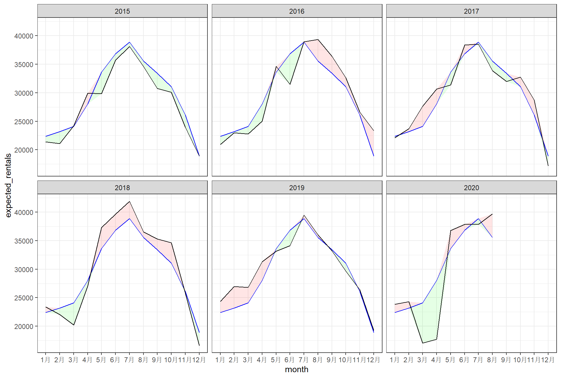
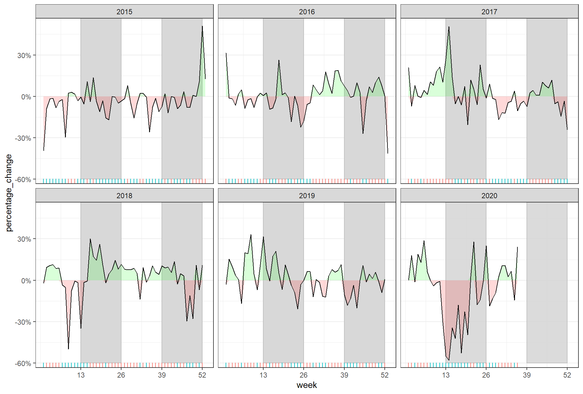
The second one looks at percentage changes from the expected level of weekly rentals. The two grey shaded rectangles correspond to the second (weeks 14-26) and fourth (weeks 40-52) quarters.
bike_graph2 <- bike %>%
  filter(year>=2015) %>%
  group_by(week) %>%
  mutate(weekly_average = median(bikes_hired)) %>%
  ungroup %>%
  group_by(week, year) %>%
  summarise(weekly_average = mean(weekly_average),
            actual_bikes_hired = median(bikes_hired)) %>%
  mutate(percentage_change = actual_bikes_hired / weekly_average - 1)


ggplot(bike_graph2,
       aes(x=week, group=1))+
  geom_rect(xmin=13,xmax=26,
            ymin=-0.6, ymax=0.6,
            colour="grey",
            alpha=0.003)+
  geom_rect(xmin=39,xmax=52,
            ymin=-0.6,ymax=0.6,
            colour="grey",
            alpha=0.003)+
  geom_ribbon(aes(ymin=0,
                  ymax=ifelse(percentage_change>0,
                              percentage_change ,0)),
              fill="green" ,
              alpha=0.15)+
  geom_ribbon(aes(ymin=ifelse(percentage_change<0,
                              percentage_change,0),
                  ymax=0),
              fill="red",
              alpha=0.15)+
  geom_line(aes(y=percentage_change))+
  geom_rug(side="week",
           aes(color=ifelse(percentage_change<0,
                            "red", "green")))+
  guides(color=FALSE)+
  scale_x_continuous(breaks=c(13,26,39,52))+
  scale_y_continuous(labels=scales::percent)+
  facet_wrap(~year)+
  theme_bw()